Currently I coach a team on Scrum, and I helped them introduce retrospectives using the five steps as outlined in Agile Retrospectives by Diana Larsen and Esther Derby:
- Set the Stage
- Gather data
- Generate insights
- Decide what to do
- Close the retrospective
I was able to attend a retrospective training with Diana Larsen in July this year. One activity I noted down back then was called “goes-into, goes-onto”. As I prepared for the retrospective, I decided to use that activity. Unfortunately I couldn’t find a reference or a write-up for this insights generating part of a retrospective. I decided to write down what I did, and my experiences with it, so that others won’t fall for the same problem in the future.
We had been through the Timeline activity, and clustered the different data into categories. I asked the team to bring these categories (on sticky notes) on a piece of flip chart paper. We arranged them in a circle.
Then I built on my knowledge about diagrams of effects and loops therein to create a chart of forces between the different categories. My memories about all the sources I used to come up with this exercise get a bit blurry, but it definitely involved several Weinberg books (An Introduction to General Systems Thinking, Quality Software Management Volume 1 and Volume 2) alongside with some knowledge from some management training, if I remember correctly.
We used each of the categories as part of the larger development system. Each of the stickies probably had some influence on the others. Also each of the stickies was probably influenced by one or more of the other stickies.
If you work in such a system, changing one variable might lead to ripple effects in the overall system, eventually changing the whole system in uncontrollable ways. That is why you focus actions in your retrospectives on two to three actions at most.
So, if you could draw dependencies between the different categories of your system, you could see which of the bubbles where less dependent on other factors. These are probably low hanging fruits for changes. Also, if you could seek items which have a lot of influence on others, you can gain big boosts in your productivity.
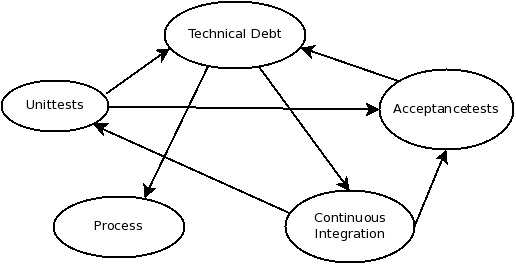
That’s basically all the theory you may need for this exercise. So, I asked the team to draw arrows between the different items they had identified. If one thing led to more of another thing, the arrow should point to that other thing. That was all. They had identified eight categories. After the drawing they had two larger circles which were interconnected at two points with each other.
We then counted each outbound and inbound arrow headed for all of the eight categories. The ones with a lot of influences on others (outbound arrows) and low inbound connections were the most interesting categories to focus on. These had large effects for the whole system, while being as independent as possible. We took these categories to the next phase where we decided what to do.
I added a picture with some made-up example. In the picture above you can see that Technical Debt influences both, the process as well as the continuous integration support. Though the better option probably is to go for unit tests first, as there are two outgoing connectors, which influence indirectly also the continuous integration capabilities of the system (through Acceptancetests and Technical Debt). The connectors might seem arbitrary, but will surely change from team to team as they are based on perceived outcomes.
[/Update]
My experience with this activity has been that the team didn’t get the point of the diagram of effects when I introduced it the activity completely. I think this made them struggle at least twice during the process of drawing the arrows for positive or negative effects on others. Based on this I consider it an advanced technique, which I would use with teams who are somewhat familiar – meaning they at least once saw a diagram of effects before – about the diagram, and how this will reduce the possible categories for further actions in the next step.


